You’ve made your first email signup form — great.
But if no one sees it, no one will subscribe.
Here are 3 places that actually work:
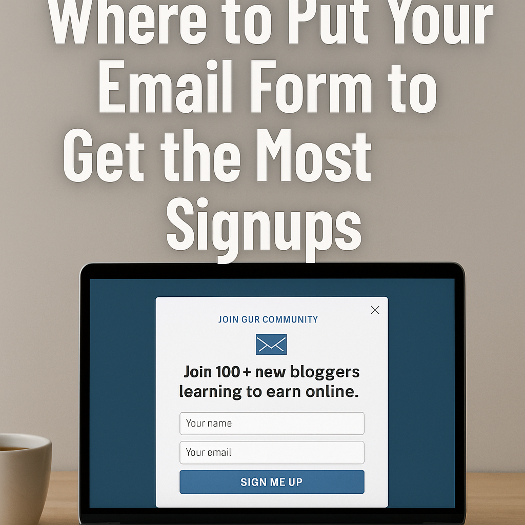
1. Top of your homepage
Above the fold = more views. Use a headline like:
“Join 100+ bloggers learning to earn online.”
2. End of every blog post
Right after someone finishes reading is when they trust you most.
Give them something helpful like:
“Download my free checklist to grow your blog faster.”
3. A separate sign-up page
Create a page like yoursite.com/free-guide and share it everywhere — in your email signature, Pinterest pins, or social media bio.
💡 Bonus tip: Use the same message in all 3 places so people recognize it and remember to act.
Don’t hide your form.
Visibility = signups.
Simple as that.
이메일 폼은 어디에 넣어야 구독자가 늘어날까?
첫 이메일 폼을 만들었나요?
잘했어요.
그런데 아무도 보지 못하면, 구독자도 늘지 않습니다.
구독을 이끌어내는 실제 효과적인 위치는 다음 3곳입니다:
1. 홈페이지 최상단
접속하자마자 보이게 하세요. 추천 문구 예시:
“100명 이상의 신규 블로거와 함께 수익 노하우 받아보세요”
2. 블로그 글 하단
글을 다 읽은 직후, 신뢰도가 가장 높아진 순간입니다.
이때 “무료 블로그 성장 체크리스트 받기” 같은 유도문구가 효과적입니다.
3. 별도 가입 페이지 만들기
예: yoursite.com/free-guide
이 페이지를 이메일 서명, SNS 프로필, 핀터레스트 링크에 계속 활용하세요.
💡 팁: 세 위치 모두 동일한 메시지를 써야, 사람들이 반복 노출되며 행동으로 이어집니다.
이메일 폼은 숨기면 안 됩니다.
보이는 만큼, 구독자는 늘어납니다.
단순하지만 효과적인 원칙입니다.